|
|
Deterrent
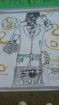
Tiwax paper with stencils 91.44 cm x 91.44 cm Oct 31. 2018 Exhibition Text: Deterrent deals with the ideology of an internal/external segregated community between classification of rich and poor, in relation to divisions in societal hierarchy. The concept of both the pieces depicts the internal and external conflicts while dealing the conscious of the real world. |
Critical Investigation:
The Theme of Deterrent was about attempting to overcome discouragement and being dispirited. I began my research by researching artists who utilized deep aspects such as nature in human form to express messages/ideologies about humanity and life. Artists such as Rene Magritte, Henry Rousseau, and Kris Preston were my main sources of inspiration for this composition. In all of their works they incorporated naturalistic elements that really provided the compositions with depth and solidarity. My piece was suppose to be reminiscent of these artists's style by incorporating nature elements to express my message about the classification in society of the rich and poor. I used Magritte's idea of clothing content and the apple face to create a tiger in my piece, with a face resembling a rich human to show dominance and how that face is concealing its true ego. Henry Rousseau's vivid nature elements such as swiftly leaves were used as an inspiration for the creation of my swiftly stencil money designs. I also incorporated Kris Preston's usage of ocean animals, by using a shark in my second background to express hierarchical divisions in society in my second background. The shark is manipulating the little fish in the ocean to signify authority and control over the less fortunate. Additionally, for the vivid construction of my backgrounds I Incorporated Adonna Khare's illustrations, to contain a three dimensional pleasing effect in the viewers' minds, by using dark vivid lines. Khare was able to present facial features in animals while resembling human qualitative, which had to be in my background. I made the tiger and the fish have facial resemblances of human characteristics. The incorporation of this added depth/form in my piece.
The Theme of Deterrent was about attempting to overcome discouragement and being dispirited. I began my research by researching artists who utilized deep aspects such as nature in human form to express messages/ideologies about humanity and life. Artists such as Rene Magritte, Henry Rousseau, and Kris Preston were my main sources of inspiration for this composition. In all of their works they incorporated naturalistic elements that really provided the compositions with depth and solidarity. My piece was suppose to be reminiscent of these artists's style by incorporating nature elements to express my message about the classification in society of the rich and poor. I used Magritte's idea of clothing content and the apple face to create a tiger in my piece, with a face resembling a rich human to show dominance and how that face is concealing its true ego. Henry Rousseau's vivid nature elements such as swiftly leaves were used as an inspiration for the creation of my swiftly stencil money designs. I also incorporated Kris Preston's usage of ocean animals, by using a shark in my second background to express hierarchical divisions in society in my second background. The shark is manipulating the little fish in the ocean to signify authority and control over the less fortunate. Additionally, for the vivid construction of my backgrounds I Incorporated Adonna Khare's illustrations, to contain a three dimensional pleasing effect in the viewers' minds, by using dark vivid lines. Khare was able to present facial features in animals while resembling human qualitative, which had to be in my background. I made the tiger and the fish have facial resemblances of human characteristics. The incorporation of this added depth/form in my piece.
 https://www.renemagritte.org/the-son-of-man.jsp
Inspiration
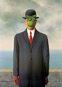
I was inspired by Rene Magritte's Son of a Man, for my composition. The painting displays rich professional clothing by incorporation a tie suit. This makes the man look like an authoritative member or a vital figure. Also, the positioning of the man in the composition, aligns the center of the work and correctly provides effective proportions and depth in the artwork. I utilized the clothing content in the Son Of a man, by making the tiger dressed in a tie suit to show authority, where the rabbit is in worn/ripped out clothes, which highlights the condition of the poor or the misfortune. In the Son of a Man, an apple is Incorporated to hide the identity of the person, similarly I used a tiger dressed in the tie suit to represent/symbolize dominance in society by certain people. My composition also portrays a cage to express how the poor are dictated and manipulated by the authoritative members of society at times.
 https://www.tate.org.uk/whats-on/tate-modern/exhibition/henri-rousseau-jungles-paris/henri-rousseau-jungles-paris-room-1
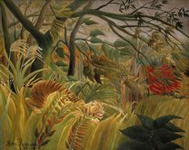
Henri Rousseau's Surprised had a vital influence on my piece. The use of a tiger in an aggressive position shows how the tiger is the dominant figure in the center work of the composition. The vivid background almost provides a method of concealment for the tiger before he attacks his prey. I incorporated a tiger in my composition to exemplify hierarchy in society. The tiger is on of the top figures in the wild life kingdom, just like rich CEO's and business men in the real world. The rabbit represents the poor or lower status people, as rabbits are on the bottom of the wildlife kingdom. Sharks are also dominant figures of the sea, and they are also on top of the hierarchy, always searching to prey on little fish, which was my second background, which emulated the theme of authority of powerful figures over the poor. The swift background gave the composition depth and color, which I emulated in my piece as I made it almost swift and smooth to really capture the central aspect of the ideology and classification between the poor and the rich. I also appreciated how the composition utilized naturalistic aspects such as swiftly leaves, which inspired my stencil ideas as I made raining money, in a vibrant and swiftly manner to show how it means nothing for the rich and so much for the less fortunate beings in society.
 https://www.pinterest.com/pin/385339311851666844/
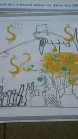
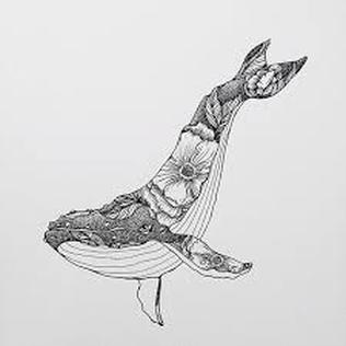
Continuing my naturalist vibes to express by message, I was also inspired by Kris Preston's drawings/illustrations of whales. I used sharks in my second background to express dominance, as they are the kings of the ocean, to amplify rich organizations. Then to add depth to my piece I added a fishing rod in the whale's mouth to express how the rich are capturing the innocent/poor individuals' dreams and shattering their self-esteems. I drew a small fish being dictated by the shark to once again show how the rich continue to dominate the poor by making them their personal slaves in society. I choose the ocean as the setting because an ocean can be very peaceful like the poor, but violent storms can alter it's view just like the rich who are causing complications in the lives of the poor. The violent actions are causing the possibilities and opportunities to cease, as the ocean is about being open, but like previously stated that openings closes really quick based on the violent/obstacles that tangle along it.
 https://www.artistsnetwork.com/art-mediums/drawing/adonna-khare-online-gallery/
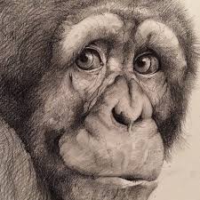
I also utilized Adonna Khare's illustrations for the construction of my backgrounds. The vivid dark thick lines add depth/dimension and give the piece form, making it three dimensional. My background had to contain this effect, as it had to be very detailed oriented and display depth/form. I Incorporated the use of dark-black vivid lines in my piece on my backgrounds to make them seem very three dimensional, and realistic. Khare also did an exceptional job at constructing the facial features that give the composition animal like qualities, which is what I wanted to display in my composition, but with a little embedding of humanized features as well. The fish and tiger in my piece resemble human features through vivid facial expressions to display a cocky attitude towards society, specifically the community of the less fortunate ones. I also made my illustrations like khare because the black lines provided emphasis, such as on the tiger's suit to express wealth due to clothing content. Similarly, the second background, the black lines put emphasis on the hat of the fish also signifying prosperity, which can assist the viewers' in visualizing the context behind the piece in correlation to it's origin/significance.
Planning sketches
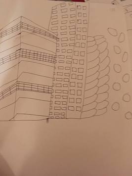
My first planning sketch was composed of buildings. I wanted to target the view of society and community by incorporating the atmosphere around the wealthy individuals. I wanted to display how the rich just cared about money. The long and extending towering buildings express the lifestyle of the rich, as they live in luxurious places. The coin tower next to the building is present to add depth and express how the rich are occupied with money and are taking all of it. They are building their own properties, instead of helping charities, communities, and people in need. The money falling represents how the rich don't really care about losing some of it due to the large quantity of money they posses. They are just throwing the money on the poor.
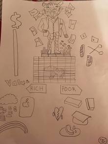
My second sketch was focused on incorporating naturalistic elements such as animals to represent my theme/message. I used a tiger to symbolize an authoritative member in hierarchy with a dog, which is on the bottom of the hierarchy in comparison to a tiger. I wanted the tiger to represent human cockiness and arrogance. So, I made the clothing content of the tiger in a wealthy business suit type of appearance to express prosperity. I made the cage to express how the rich feel like they can dictate the less fortunate because of superiority due to status. The dog displays humans who are ridiculed by authority in society and have no say. I also made some symbols to represent the ideals about the rich and poor. I made elements such as hats, degrees, etc. to classify the poor, while the rich I constructed expensive elements such as tablets, money raining, and rainbows to classify them, as they are always taking the easy way out. Also the rich base things on money rather than the quality or value of things, which the money bar represents on the side.
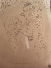
My third sketch was based on my second sketch but a different perspective and ideology. The tigers are the authoritative members, and the little rabbit on the bottom is a poor human. The tiger spitting garbage out of his mouth on the rabbit brings up the point of how the prosperous individuals create melancholic vibes in the mind of the poor, by treating them with total disrespect, which also destroys the self-esteem of the poor. The poor just take that treatment and others just watch just like the other tiger, without any jusitfactions or repercussions for this actions.
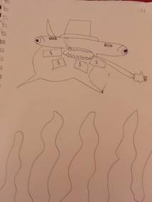
My third sketch was for my second background which I wanted to be distinct from my first background about tigers, but I still wanted to focus on naturalistic aspects. I used a hammerhead shark to express authority with a little fish being captured by the shark to express the similar theme of dilation done by rich members in society. The money attached to the shark's mouth represent how the rich feel they can buy the poor and make them do things against there will due to bribe. I chose the shark because they are in oceans, and oceans represent a deep meaning of endless possibilities, but they can also be disastrous as storms on oceans can change their view. The shark is the storm that occurs in the way of the little fish, trying to stop it from reaching it's full inner potential.
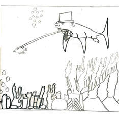
My fifth Planning sketch was for my second background. I wanted to continue my theme of including naturalistic aspects such as animals to convey my message. I like how the vivid black lines gave the illustration a three dimensional essence. The detailed oriented sea plants on the bottom provide the piece with depth and formality. This sketch ended up being the final for my second background because it was a perfect capture of the theme and moment. The viewer can easily see the incorporation of my theme in the composition.
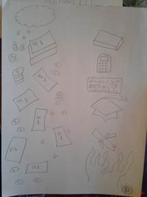
My last planning sketch was based more for my stencil designs. I wanted to create wide contrast of things between the classification of the poor and the rich. For the rich aspect I made a cloud with coins raining down to highlight how easily some rich folks make money based on their parents success and how they were born with a golden spoon in there mouth. For the poor I made calculators, books, graduation hats, degrees, and fire. They things represent education and the the hard work ethic of the poor, as they have to work twice as harder to achieve things in life than the rich. The fire express how sometimes even with that hard work, these individuals still don't get the value or the money they are worth. They feel like all of that trauma and endless drive is for nothing, as less hardworking individuals still rule and make money in society.
Experimentation
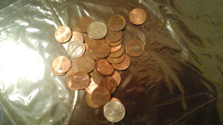
To start my project I began thinking about my concept of the relationship in community about the rich and the poor. I began talking myriads of pictures of objects centered around my daily life that represent and were symbolic towards that ideology. I took multiple pictures of dollar bills in various orientations. I took pictures of the dollars bills to make up my stencil ideas and for my backgrounds as well. The reason I used various orientations was because I didn't know if I wanted money falling, or if I preferred in a bundle or a combination of both. After that I took pictures of coins. I also used various orientations of coins because I was thinking whether I should stack coins to make a money tower with the tiger standing over it or if I used make a cloud above coins raining down the money. I also took pictures of coins falling down in a clump of coins to express maybe how the rich throw the money at the poor. Then, I took pictures of nice neighborhoods around me and buildings. I wanted to use these images as an inspiration towards representing the rich community. I also wanted to make buildings and architectural designs to express my viewpoint. So, I took pictures of clean buildings and neighborhoods to express the living conditions of the rich, as well as the vibes. The pictures of dirty buildings were taken by me to express the living conditions of the poor. The grey and blackish colors of the buildings were used intentionally because I wanted to express the view point of lost dreams and melancholic vibes. I also took pictures of plants, rocks, and various natural aspects to make up the idea for my second background with the fish. I used the pictures of the naturalistic aspects to make up the setting of the sea. I made rocks, plants, and water gushing plants on the bottom of the final background to display the ocean setting. Next, I used daily items such as backpacks, pencils, pens, and etc. to express the inspiration for my stencil designs for the poor individuals. I multiple shots of my backpack to express the value the poor people feel towards that object because it contains their hard work and knowledge. Then, I arranged pencils and pens in various orientations. I wanted to display how the these elements were the poor's way of making their mark in the world. These tools were there symbol of power through words, knowledge, and ideas. I also took multiple shots of books and folders to express the friends that the poor have. The books and folders are the best friends of the poor in times of need. I also took pictures of my tablets, phones, computers, to express the rich stencil design and because I wanted to express how the rich valued things of price rather than knowledge. For both of my backgrounds I wanted create a clothing content as well. So I took pictures classy things in my house such as tie suits, belts, watches, to represent the appearance of the rich. I wanted to express how the rich were superior in their minds due to materialistic elements. Then, to represent the poor pictures I took shots of old clothes to display their view/appearance. I wanted to include these clothing contents on the small animals in both of my backgrounds to reveal the distinction between the classification between the rich and poor. I wanted to signify the hierarchical status and structure of power based on physical representation. I was also experimenting by taking to people about my ideas and planning sketches. I was really able to get some insight, by people telling me to make my sketches of my backgrounds more like illustrations by installing vivid black lines with shaded areas to make the backgrounds pop out and have a three dimensional sort of effect. I also included pictures of coins on table designs intentionally. because I wanted to capture the rich background for both my pieces originally, and both of my backgrounds were inspired by those designs. All of the elements mentioned were incorporated for both of my pieces, as they focused on the similar message, they don't have two distinct messages.
To start my project I began thinking about my concept of the relationship in community about the rich and the poor. I began talking myriads of pictures of objects centered around my daily life that represent and were symbolic towards that ideology. I took multiple pictures of dollar bills in various orientations. I took pictures of the dollars bills to make up my stencil ideas and for my backgrounds as well. The reason I used various orientations was because I didn't know if I wanted money falling, or if I preferred in a bundle or a combination of both. After that I took pictures of coins. I also used various orientations of coins because I was thinking whether I should stack coins to make a money tower with the tiger standing over it or if I used make a cloud above coins raining down the money. I also took pictures of coins falling down in a clump of coins to express maybe how the rich throw the money at the poor. Then, I took pictures of nice neighborhoods around me and buildings. I wanted to use these images as an inspiration towards representing the rich community. I also wanted to make buildings and architectural designs to express my viewpoint. So, I took pictures of clean buildings and neighborhoods to express the living conditions of the rich, as well as the vibes. The pictures of dirty buildings were taken by me to express the living conditions of the poor. The grey and blackish colors of the buildings were used intentionally because I wanted to express the view point of lost dreams and melancholic vibes. I also took pictures of plants, rocks, and various natural aspects to make up the idea for my second background with the fish. I used the pictures of the naturalistic aspects to make up the setting of the sea. I made rocks, plants, and water gushing plants on the bottom of the final background to display the ocean setting. Next, I used daily items such as backpacks, pencils, pens, and etc. to express the inspiration for my stencil designs for the poor individuals. I multiple shots of my backpack to express the value the poor people feel towards that object because it contains their hard work and knowledge. Then, I arranged pencils and pens in various orientations. I wanted to display how the these elements were the poor's way of making their mark in the world. These tools were there symbol of power through words, knowledge, and ideas. I also took multiple shots of books and folders to express the friends that the poor have. The books and folders are the best friends of the poor in times of need. I also took pictures of my tablets, phones, computers, to express the rich stencil design and because I wanted to express how the rich valued things of price rather than knowledge. For both of my backgrounds I wanted create a clothing content as well. So I took pictures classy things in my house such as tie suits, belts, watches, to represent the appearance of the rich. I wanted to express how the rich were superior in their minds due to materialistic elements. Then, to represent the poor pictures I took shots of old clothes to display their view/appearance. I wanted to include these clothing contents on the small animals in both of my backgrounds to reveal the distinction between the classification between the rich and poor. I wanted to signify the hierarchical status and structure of power based on physical representation. I was also experimenting by taking to people about my ideas and planning sketches. I was really able to get some insight, by people telling me to make my sketches of my backgrounds more like illustrations by installing vivid black lines with shaded areas to make the backgrounds pop out and have a three dimensional sort of effect. I also included pictures of coins on table designs intentionally. because I wanted to capture the rich background for both my pieces originally, and both of my backgrounds were inspired by those designs. All of the elements mentioned were incorporated for both of my pieces, as they focused on the similar message, they don't have two distinct messages.
Process- Procedure
Process 1
1. draw my first background
2. scan my background and open it up in Photoshop-make edits such as contrast/brightness variations
3. transfer the background to Mr.Chad by use of a flash drive to print off background
4. cut out wax paper longer than the board for the stencils
5. get wax paper and draw stencils for my first piece in reverse order
6. use a gradient knife to cut out the stencils on the wax side
7. Go to MIAD, to set up the process of making stencils print on background
8. Place a sheet of large grey paper on bottom of board ans stencil paper
9. Using a blue tape, tape the wax side of the paper on the backside of the board, cut off any extra edges
10. Grab color ink for first stencil and a squeegee and a spoon
11. for first trial/proof, with the spoon lay a bead of your color ink in front of your first stencil
12. grab the squeegee and propel the color ink downward through your stencil and then in reverse order through the stencil
13. Lift the board up and see if your stencil is visible or not, if not apply more pressure when using the squeegee
14. Once, you get it visible enough remove the grey sheet of paper and place your background with the stencil on top attached to the board
15. Grab the Squeegee and repeat steps 12-13 for your first stencil to transfer it to the background and place that stencil on your background based on your desired amount
16. After done, place your background to dry and fold the grey sheet of paper to use for other stencils
17. You can also place the stencil on your other background if you wish while the first one dries repeating steps 1-16
18. Repeat steps 1-17 for other stencils, but replace the grey proof paper with a new one once it's completed used up
Process 2
1. draw my second background
2. scan my background and open it up in Photoshop-make edits such as contrast/brightness variations
3. transfer the background to Mr.Chad by use of a flash drive to print off background
4. cut out wax paper longer than the board for the stencils
5. get wax paper and draw stencils for my second piece in reverse order
6. use a gradient knife to cut out the stencils on the wax side
7. Go to MIAD, to set up the process of making stencils print on background
8. Place a sheet of large grey paper on bottom of board and stencil paper
9. Using a blue tape, tape the wax side of the paper on the backside of the board, cut off any extra edges
10. Grab color ink for first stencil and a squeegee and a spoon
11. for first trial/proof, with the spoon lay a bead of your color ink in front of your first stencil
12. grab the squeegee and propel the color ink downward through your stencil and then in reverse order through the stencil
13. Lift the board up and see if your stencil is visible or not, if not apply more pressure when using the squeegee
14. Once, you get it visible enough remove the grey sheet of paper and place your background with the stencil on top attached to the board
15. Grab the Squeegee and repeat steps 12-13 for your first stencil to transfer it to the background and place that stencil on your background based on your desired amount
16. After done, place your background to dry and fold the grey sheet of paper to use for other stencils
17. You can also place the stencil on your other background if you wish while the first one dries repeating steps 1-16
18. Repeat steps 1-17 for other stencils, but replace the grey proof paper with a new one once it's completed used up
Reflection 1
For my first piece I would say it was fairly, semi-successful. My first background was a very detailed oriented sketch that really took time and effort. The tiger really made a three dimensional type of effect. It really incorporated aspects of Kathie's illustrations, as I used black vivid lines on the tiger's illustration on my background. That made it seem very real and appeasing. But it was distinct from Kathie's illustrations in relation to how my sketch displayed human features concealed through the tiger, as Kathie was mainly based on animals features with no human features installed. My stencil designs for my first background were semi-successful. I wasn't really trained in this process prior to ever and it was my very first time doing a silkscreen. The stencils for my tiger background were still pretty decent, I was able to get the coins and money sign on it pretty fairly visible. I had some dirty ink get on my background because it was really an arduous task to get a clean stencil every time because you had to move the background back and forth between stencils and lift up stuff, wash your board, and it was all in a very occupied space. Sometimes, I got accidentally hit by people when I was working on my stencils, which really impacted the overall quality of my piece. But this project was very challenging and frustrating with the stencil portion because I wish I had more time to really enhance my skills with this process for a better outlook quality. My favorite element about this project was drawing my background because it was really appealing in my personal perspective, which kinda of saved my piece from being completely destroyed.
Reflection 2
For my second piece I would say again the background element of drawing and constructing my background was really exciting and enjoying. My background with the fish turned out to be very good in my opinion. I liked the detailed oriented plants at the bottom of the sea and the shark on top of the composition. However, when it came to the stencil portion it started out decent, but it got very dirty in the middlemost area of the composition. This happened because of lack of experience with the silkscreen process and frustration due to working in a very occupied atmosphere. But, I was able to control my emotions and fix the composition to some extent and to the best of my ability. But I think, I was also semi-successful because I wanted to just get to the point about the classification between the poor and rich, which I think the stencils blended in with the backgrounds really portrays the message. The background with the fish will appeal people who view, even though it's not the most clean again due to lack of practice of the process. I wouldn't have expected to be super successful with something that I only had one day practice of, no disrespect to anyone. But I am proud of my experience with a new challenging project because I don't fear failure and embrace obstacles, but I wish that I am better prepared for coping with these obstacles.
Compare and Contrast 1
For my first piece I did have some similar and distinct qualities for the creation of my composition. One similar quality was that in m tiger background I Incorporated Kathie's usage of black lines that really make my illustration three dimensional. However, Kathie mainly focused on animal features but I was able to incorporate human characteristics within the tiger face and body structure. I also used a tiger just like Henry R. did. He used it as a lethal figure, just like I utilized the tiger as a menacing figure in relation to a authoritative member in society that overrules others. A distinct aspect was the setting of the composition, as I used it in real-world and a human setting while Henry R. used in a very typical fashion by using a jungle setting.
Compare and Contrast 2
As for my second piece I also had both similar and dissimilar qualities in my piece. One similar aspect in my second piece was utilizing a sea creature like Kris Preston used. I used the sea creature as a menacing figure, while Kris Preston incorporated a whale with designs that signify a peaceful creature, so the tone of the creatures and the deception were very distinct, as I made the shark dress in a very elegant clothing content. Another similar aspect was incorporating Kathie's illustrations facial features in my second piece. If you deeply scrutinize the composition you can tell that the small fish in the left has a worried expression that symbolizes a human who is being dictated my the prosperous member. Another dissimilar aspect was again I concealed some human expressions in the shark while Kathie only created facial qualities of creatures of nature.
ACT Questions
1. Clearly explain how you are able to identify the cause-effect relationships between your inspiration and its effect upon your art work? In Kathie's work there were black vivid lines that really made them three dimensional, which is what was in both of my pieces as well. Artists such as Henry R. and Kathie utilized creatures of nature to express their views, which was the central aspect of my composition as well. I also incorporated Magritte's perspective by concealing human characteristics in the tiger face and in the fish too by holding a human face in it.
2. What is the overall approach (point of view) the author ( from your research) has regarding the topic of your inspiration? The works I researched like Kathie's illustrations and Henry R.'s Surprised, the authors who commented and speculated on the works were very vague and presented the information in a very unambiguous aspect. They said that Kathie's illustrations were just about nature life in relation animals. The authors concerning Henry's work were also stating that the picture is just about a hungry tiger.
3. What kind of generalizations and conclusions have you discovered about people, ideas, cultures, etc. while you researched your inspiration? I acknowledged that Henri R. was really all about nature. Henri once stated that the only teacher he had was nature itself. Kathie was all about capturing vivid facial expressions and about comprehending about human nature.
4. What was the central idea or theme around your inspirational research? The central idea for both of my artworks was to express how in today's community there are certain classification elements that separate the prosperous from the poor. The rich don't really care about the insight or value the poor at all.
5. What kind of inferences (conclusions reached on the basis of evidence and reasoning) did you make while reading your research? The inferences and conclusions I reached were that people just create stereotypical assumptions based on materialistic elements such as money. They don't judge a individual's heart or work ethic, they just cast opinions and ridicule them on status issues.
Annotated Bibliography
The Son of Man, 1946 by Rene Magritte. (n.d.) Retrieved November 1, 2018 from https://www.renemagritte.org/the-son-of-man.jsp
Adonna Khare Online Gallery (n.d.) Retrieved November 2, 2018 from https://www.artistsnetwork.com/art-mediums/drawing/adonna-khare-online-gallery/
Henri Rousseau: Jungles in Paris Room Guide: Room 2. (n.d.) Retrieved November 5, 2018 from https://www.tate.org.uk/whats-on/tate-modern/exhibition/henri-rousseau-jungles-paris/henri-rousseau-jungles-paris-room-1
Pin by Kris Preston on Whales 2018. (n.d.) retrieved November 6, 2018 from https://www.pinterest.com/pin/385339311851666844/
Adonna Khare: Biography. (n.d.) retrieved from November 7, 2018 from http://www.visionswestcontemporary.com/artist-biography/adonna-khare.html
